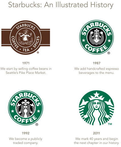
Starbucks introduces new, less memorable, logo
Big deal. I don’t like it. Lacks the distinction and “tradition” the former logo had. If you really want to reach people in China, better tell them your name.

Starbucks gives the following reason for the change: The change reflects the company’s efforts to expand both internationally and through a wider array of menu and consumer-product items. Starbucks last month said that it will increase its store count in China sevenfold by 2015, while encouraging more daily food- and beverage-buying periods, or so-called “dayparts,” by adding new in-store menu items.  http://srph.it/fbgW3R
Really? It doesn’t say that to me. To me it says ho hum. Soft lines. Lack of distinction. Losing its differentiation. Boring.
Our youngest daughter loves green though. She’ll be excited.
Not as bad as GAP’s recent logo change, but a non-winner in my book.
1 of Many
Passion Rules!

0 comments
Kick things off by filling out the form below.
Leave a Comment