How Starbucks violated the Primal Code
There has been a lot of discussion about the new Starbucks Coffee logo. Actually, “Coffee” is no longer part of the logo, just the mermaid. So what is Starbucks, an aquarium or a gathering place where people can meet and enjoy coffee and all the accoutrements. The new logo implies the former.

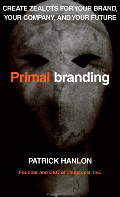
Over the years I’ve become a fan of Patrick Hanlon’s approach to branding, Primal Branding. I’ve blogged about Hanlon before, but the impact his Primal Code can have on a product or institutional brand is hard to deny.
At just about every place I’ve worked, (Harley-Davidson, Sea-Doo, Wellcraft, Donzi, The University of Florida, NC State) the primal code abounds and because of that, success has followed.
Hanlon’s premise is pretty simple. “When people believe, they belong. When they belong to the group that surrounds your product or service, they are willing to advocate their belief to others.” The elements that lead people to believe can be found in the Primal Code:
- The Creation Story: Where are you from?
- The Creed: What do you stand for?
- The Icons: Logos, sounds, smells, tastes.
- The Rituals: Repeated interactions with your enterprise.
- The Pagans or Nonbelievers: Who are the believers? Who are the outcasts?
- The Sacred Words: Specialized words from your belief system.
- The Leader: The risk taker, catalyst, iconoclast, visionary.
I thought Starbucks had them all until they unveiled a new logo last week. Now I’m not so sure. Just what is the company’s commitment to the brand; the brand we know today.
So what did Starbucks give up with the new look? I’d argue that four of the seven elements have been diminished with the new logo and the reasoning behind the change.
The Icon is the most visible. That would be the old round logo with Starbucks Coffee and the mermaid in the middle. It was recognizable from across the room. Even if you couldn’t read the words, you knew it was Starbucks. From across the room the new logo looks like a shampoo label, or canned tuna fish.
The Sacred Words were also sacrificed. The most sacred word … COFFEE. That’s what it was all about. Starbucks Coffee was different, some would argue better, than most coffee shop coffee. People made a first contact with Starbucks because of their coffee.
What they found when they went to buy a cup of coffee at the Starbucks Coffee shop was an environment where they could meet friends, relax, hangout, prepare for the day or wind down at the end of the day. So with the move away from Coffee, Starbucks has also damaged The Ritual with the change in logo.
Finally, I believe they also diminished The Creed. At Starbucks The Ritual and The Creed and the Sacred Words are interconnected. Just what does the new Starbucks stand for? I don’t know.
Now I’ll admit, the billions of potential customers in China and India probably don’t know the Starbucks story the way we do. They may not know about things like the Creation, the Creed, the Icons or the Ritual. But without that foundation, isn’t Starbucks just another coffee shop. And they will be competing with just another coffee shop that has emerged in the last few years to compete by selling less expensive coffee alongside its other offerings, McDonalds.
I know I’d want all the tools possible to compete against McDonalds. And while some may say a logo is just a small part of the corporate or institutional brand, it can say a lot about the future of the company.
I like Starbucks and I may be over reacting, but if this is an indication of what’s to come, I just may stop by the Golden Arches to try a cup.
1 of Many
Passion Rules!

0 comments
Kick things off by filling out the form below.
Leave a Comment